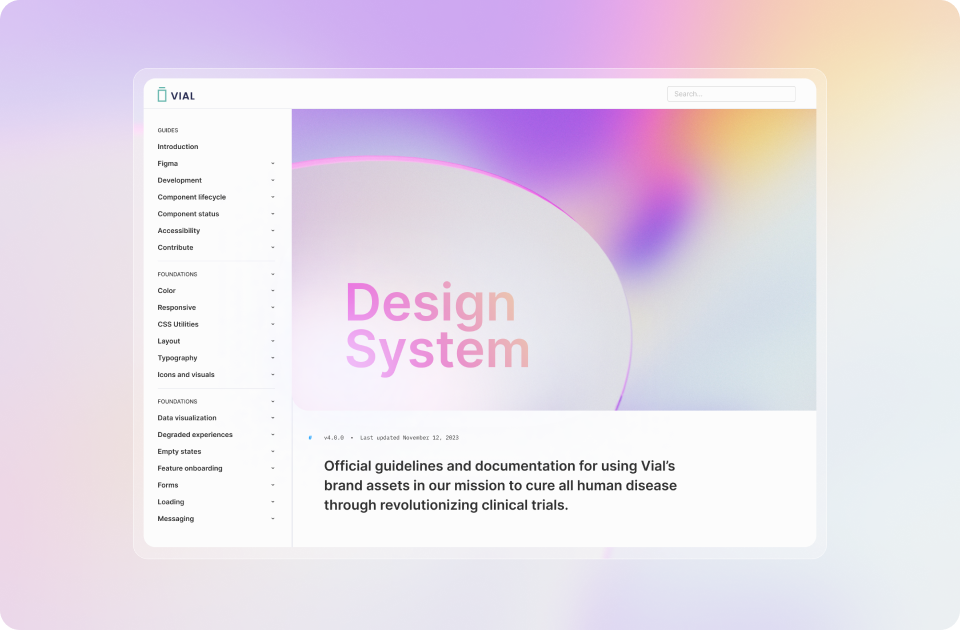
Vial Design System
Vial is a clinical research organization (CRO) delivering faster and more
efficient trials for sponsors through its end-to-end technology platform. To deliver on this vision
our team was tasked with building multiple customer facing products and several internal facing
applications.
To ensure consistency and ease of scaling it was important to build a robust, yet flexible design system, that would allow current and future designers to be able to work faster, more efficiently and ensure visual and functional consistency between platforms.
To ensure consistency and ease of scaling it was important to build a robust, yet flexible design system, that would allow current and future designers to be able to work faster, more efficiently and ensure visual and functional consistency between platforms.
- Component Creation
- Visual design
- Pattern Creation
- Typography
Understanding the Challenge
The clinical
research landscape demands meticulous attention to detail, adherence to regulatory standards, and
seamless user experiences. The challenge lay in harmonizing diverse applications while accommodating
unique functionalities and compliance requirements of each platform. The design system needed to
serve as a unifying bridge, allowing for efficient development, easy maintenance, and consistent
user interactions across the CRO's suite of tools.
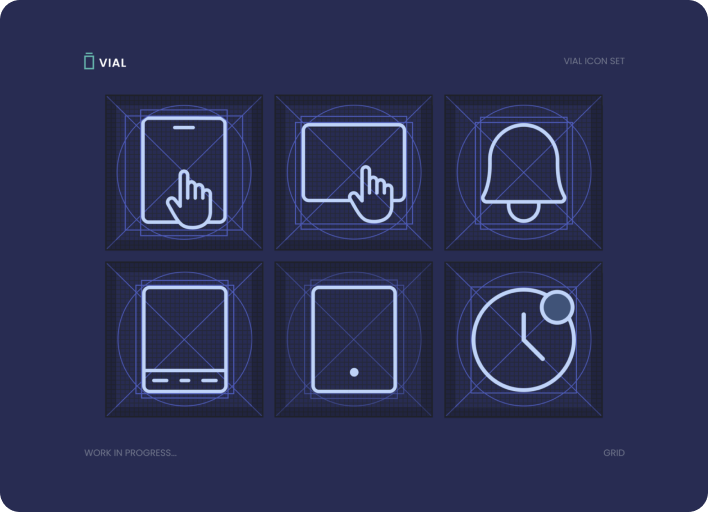
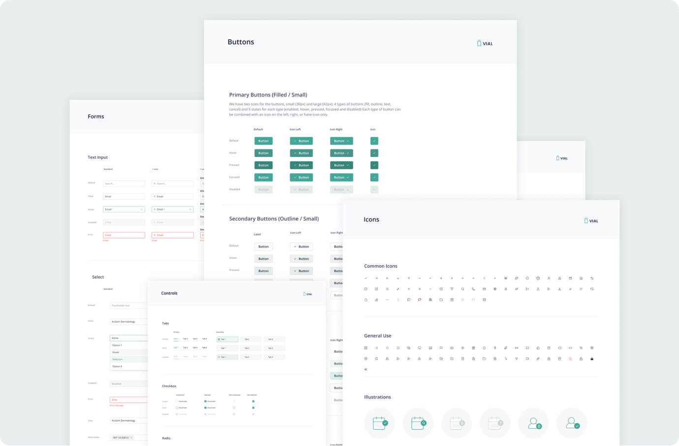
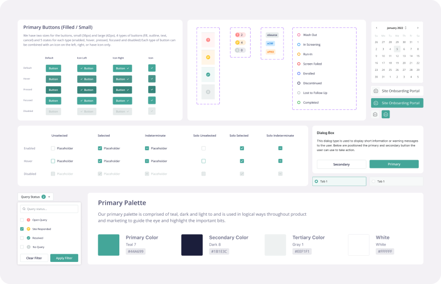
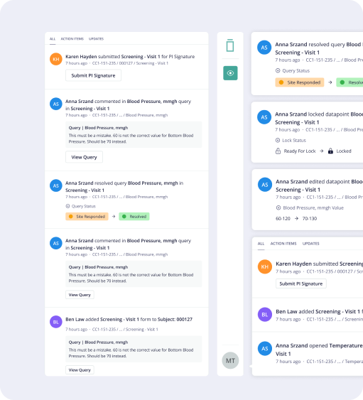
Design Principles & Components
The core
principles of consistency, modularity, flexibility, and compliance guided the creation of a
comprehensive library of reusable components. These components ranged from elemental design elements
like buttons and inputs to more complex modules such as form sections, data visualization tools, and
navigation patterns.
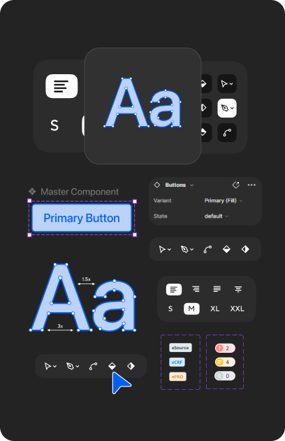
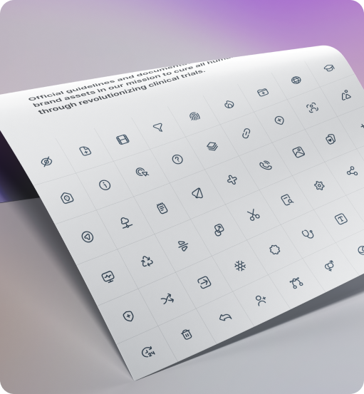
This was the most time-consuming portion of the project. I had to make decisions regarding naming conventions, categorization, organization, and presentation. I spent a lot of time naming and renaming my Figma layers and organizing my components page.
This was the most time-consuming portion of the project. I had to make decisions regarding naming conventions, categorization, organization, and presentation. I spent a lot of time naming and renaming my Figma layers and organizing my components page.
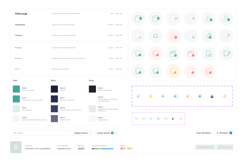
Consistency Across Platforms
Creating a
unified design language was pivotal. Leveraging atomic design principles, I developed a hierarchical
system of components, from atoms (such as buttons and inputs) to molecules (like form sections and
tables) and organisms (complete sections or modules). This modular approach facilitated consistent
design elements that could be combined and customized as needed for different platforms.
Continuous Iteration & Evolution
The design system
was not static but evolved in sync with new platforms that we were designing as well as user
feedback. Regular reviews and feedback loops ensured that the system stayed relevant and adaptable
to new design requests. Design Systems are by nature, a living thing. I set myself weekly reminders
to update, review, and share the style guide.
Results & Impact
- Consistency and Efficiency: Development cycles became more efficient, as reusable components reduced redundancy and expedited the design-to-development process.
- Streamlined Maintenance: Updates and maintenance became more manageable across platforms, reducing the time and effort required for changes or enhancements.
- Improved User Experience: Users benefited from a cohesive interface, enhancing usability and reducing the learning curve across multiple applications.